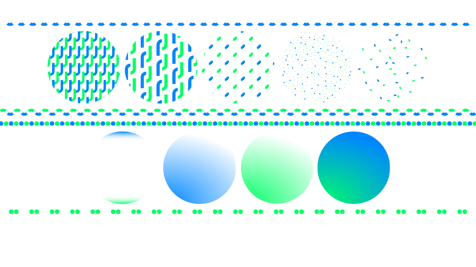

Branding and visual identity for a geojournalism course by Dataninja.
the brand
geojo
Geojournalism training to address climate change.
The GEOJO project aims to establish an integrated educational program designed to empower students with the skills and knowledge needed for effectively communicating critical information about climate change and environmental issues through the methodology of data journalism.
Simultaneously, it endeavors to elevate students’ digital proficiency.
Indeed, data journalism at its core uses the tools provided by statistics
and informatics to effectively work with data and analyze them to extract meaningful insights and patterns.
The project has a specific focus on geospatial data and its visualization (maps).
logo design
proposals
I explored various themes inspired by the themes of the course and the naming. The following two are the strongest concept other than the winning one.
MOUNTAIN
I started with the profile of a mountain, covered in snow, with its glaciers, against a blue, clean sky.
Mountains, and melting ice caps in particular, are a symbol of the consequences of climate change so the visual will make the connection immediately to that part of the project.
For the data analysis part, I overlayed the stark silhouette of the mount top with an area chart.


BUBBLE
Topographic maps with contour lines and heatmaps are widely used tools both for representing the territory and for analyzing complex data.
Their overlays can be used to draw enclosed shapes—in this case, the initials g and j—while maintaining a friendly, youthful tone, yet already introducing highly technical tools.




CHOSEN LOGO
GEOJOURNALISM
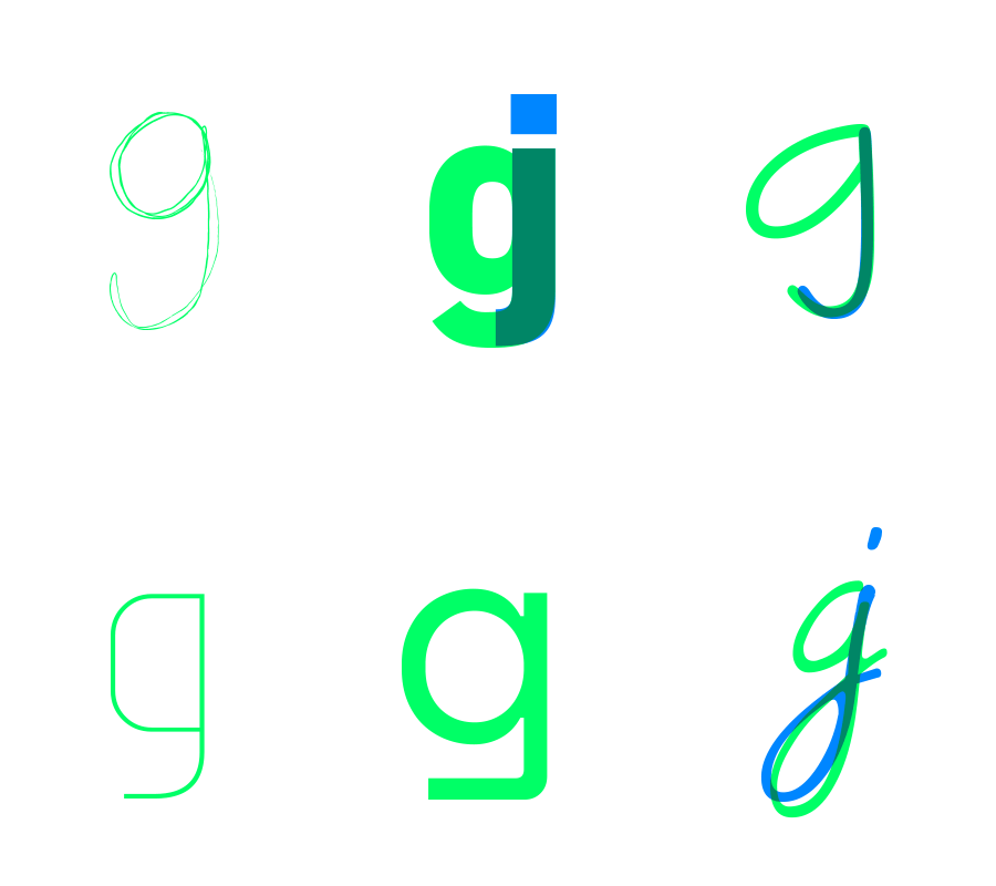
This concept emerged while drawing and writing the word “geojo” and finding recurring shapes within it. There is modularity and rhythm in these circular letters and an overlapping of the j and o to make a g.
I decided to play with this modules to make a typographical proposal with a pop mood.
CLIMATE CHANGE
For the colors, I decided to stick to the science and nature theme with neon hues since printed materials would be very rare.


TYPOGRAPHY




VISUAL IDENTITY GUIDELINES